The Vibrations of the Colors Purple and Orange
YEAR: 2022
LOCATION: Copertino (LE)
AREA: 80sqm
SERVICES PROVIDED:
Consultations
Design
Supervision
Turnkey services
TYPE: Commercial
BUDGET: €20.000,00
PROJECT STATUS: Completed
The interior design project for La Yogurteria, an Italian franchise chain leader in the production of yogurt and sweets, was conceived by Gloria Colazzo Studio in 2022.
Intervention takes place within a commercial space of 80 sqm in Copertino, with a budget of €20,000.
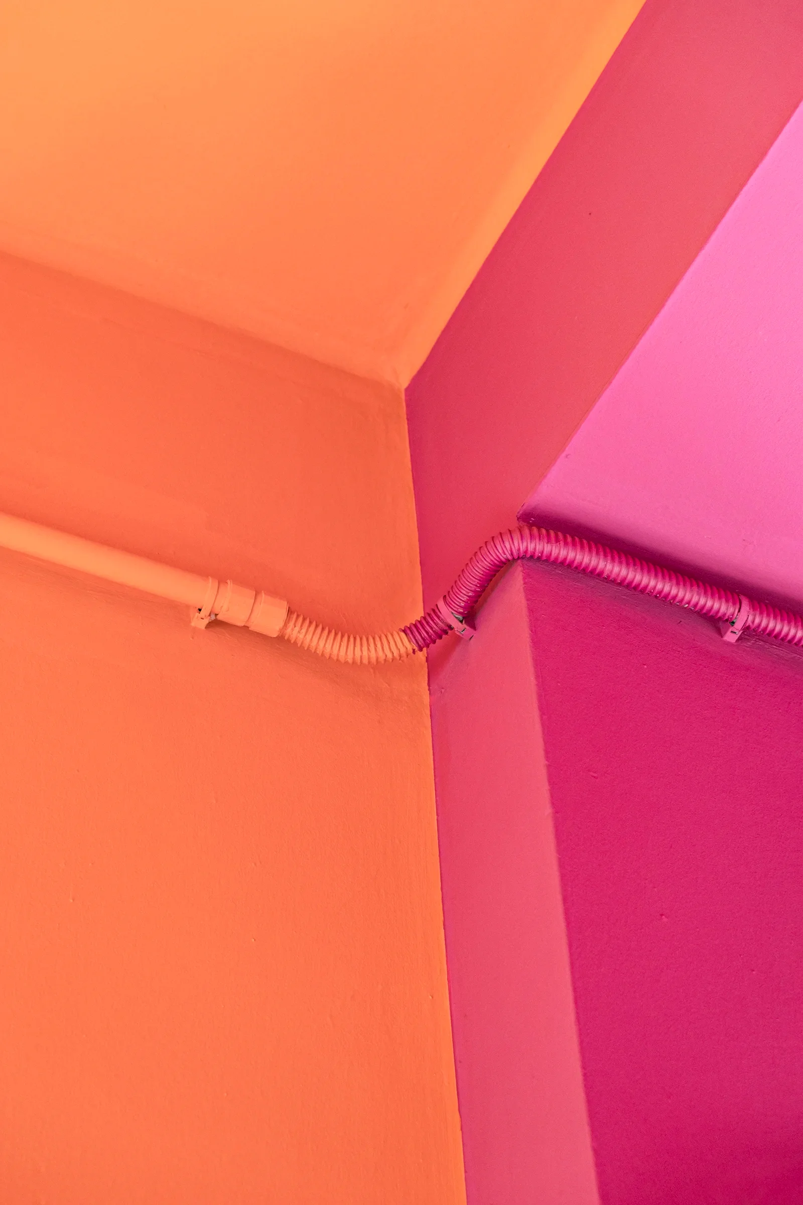
The main goal was to create a space that expresses the liveliness and cheerfulness that characterize the brand. The design is fresh and dynamic, predominantly featuring two distinctive colors: purple and orange.
APPROFONDISCI IL PROGETTO +
Functionality and Hospitality: The Counter Design
One of the key elements of the project is the counter, which welcomes visitors upon entry. Its curved shape was designed to eliminate sharp corners and create an environment that invites conversation and socialization, while also being able to accommodate multiple people without compromising comfort.
The design of this central element is both functional and aesthetic. It is arranged so that everything is in plain view, allowing customers to appreciate the quality of the products being prepared.
Visible are also the preparation areas, such as the section dedicated to cooking crêpes and preparing other sweets, allowing visitors to watch the preparation in real time, emphasizing the freshness and quality of the ingredients.
Fluid Space and Flow
The service area was carefully designed in compliance with legal limits, respecting the necessary safety and functionality regulations. However, the design has optimized the space, creating an environment that offers customers a greater sense of comfort and ample possibilities for movement.
The layout, with smart management of flows and access points, ensures high standards of functionality, facilitating both the staff’s work and the customer experience.
Play of Light and Shadow
Another distinctive element of the project is the playful use of light and shadow, especially applied to the entrance display window.
Targeted lighting not only highlights the products on display but also helps create a welcoming and dynamic atmosphere that invites passersby to enter and explore the interior environment.
Brand Identity and Visual Impact
The interior design project is not only an aesthetic interpretation but also a constant reference to La Yogurteria’s brand identity.
The colors orange and purple are, in fact, the primary colors of the brand identity, and the use of these shades within the space helps reinforce the connection between the store and the brand image. In particular, orange, used predominantly for visuals and main surfaces, becomes the visual symbol of La Yogurteria.
This not only creates visual continuity with the brand but also instills a sense of recognition and familiarity for customers.


Atmosphere of Creativity and Harmony
The choice of colors is no accident. Orange, known for its ability to stimulate conversation and creativity, is used to cover most of the surfaces, creating a lively and welcoming environment.
Purple, a symbol of elegance and harmony, pairs perfectly with orange, giving life to a space where the vibrant energy of the two tones translates into a new dimension of joy and comfort.
This color combination not only reflects the brand’s identity but also creates an engaging experience for customers, fostering a pop atmosphere that mirrors the young and dynamic spirit of La Yogurteria.